Manole Atelier
Manole Atelier
Manole Atelier
Manole Atelier is an artisan pastry atelier based in Bucharest, with the mission of bringing the elegance of Parisian pastry culture to the city.
Manole Atelier is an artisan pastry atelier based in Bucharest, with the mission of bringing the elegance of Parisian pastry culture to the city.
Manole Atelier is an artisan pastry atelier based in Bucharest, with the mission of bringing the elegance of Parisian pastry culture to the city.
Our Goal
The main goal was to create a distinctive visual identity that avoids the clichés commonly found in artisan pastry branding. Instead of relying on literal symbols such as croissants or desserts, the identity was designed to express the elegance, craftsmanship, and attention to detail that define Manole Atelier.
The main goal was to create a distinctive visual identity that avoids the clichés commonly found in artisan pastry branding. Instead of relying on literal symbols such as croissants or desserts, the identity was designed to express the elegance, craftsmanship, and attention to detail that define Manole Atelier.
The main goal was to create a distinctive visual identity that avoids the clichés commonly found in artisan pastry branding. Instead of relying on literal symbols such as croissants or desserts, the identity was designed to express the elegance, craftsmanship, and attention to detail that define Manole Atelier.
Solution
Solution
Solution
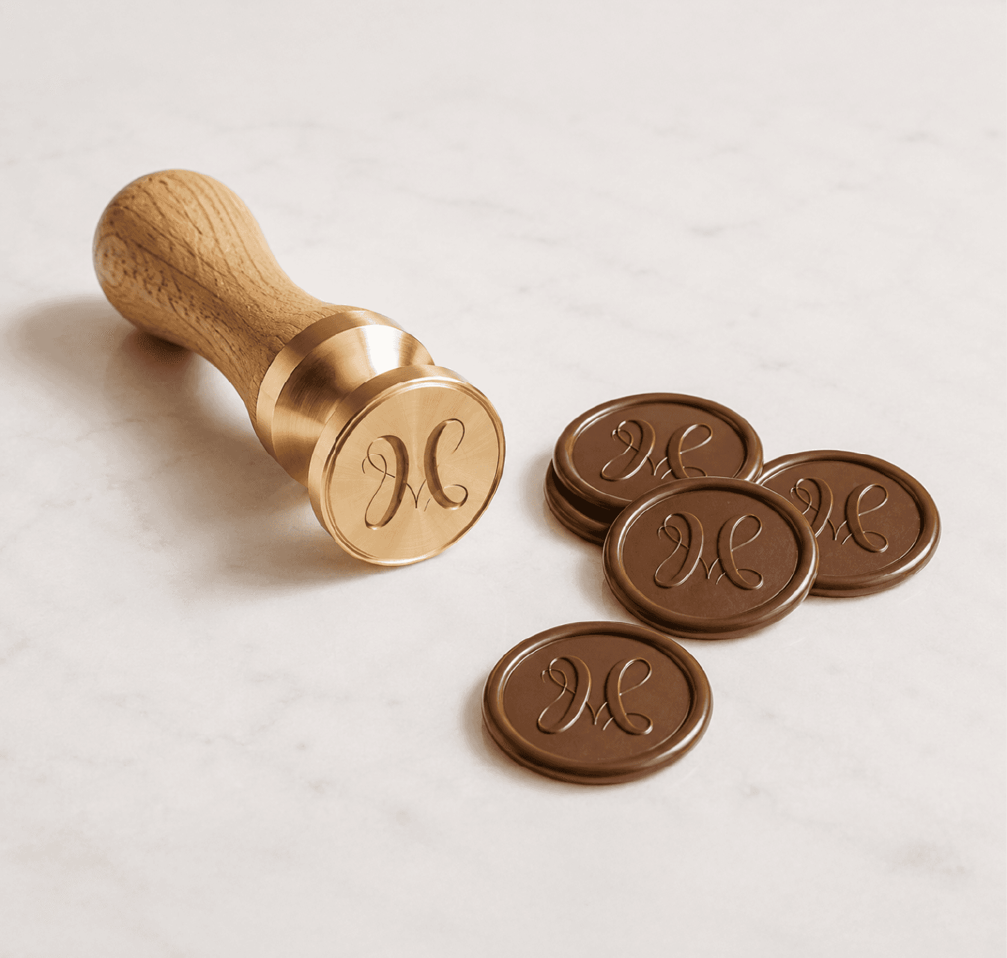
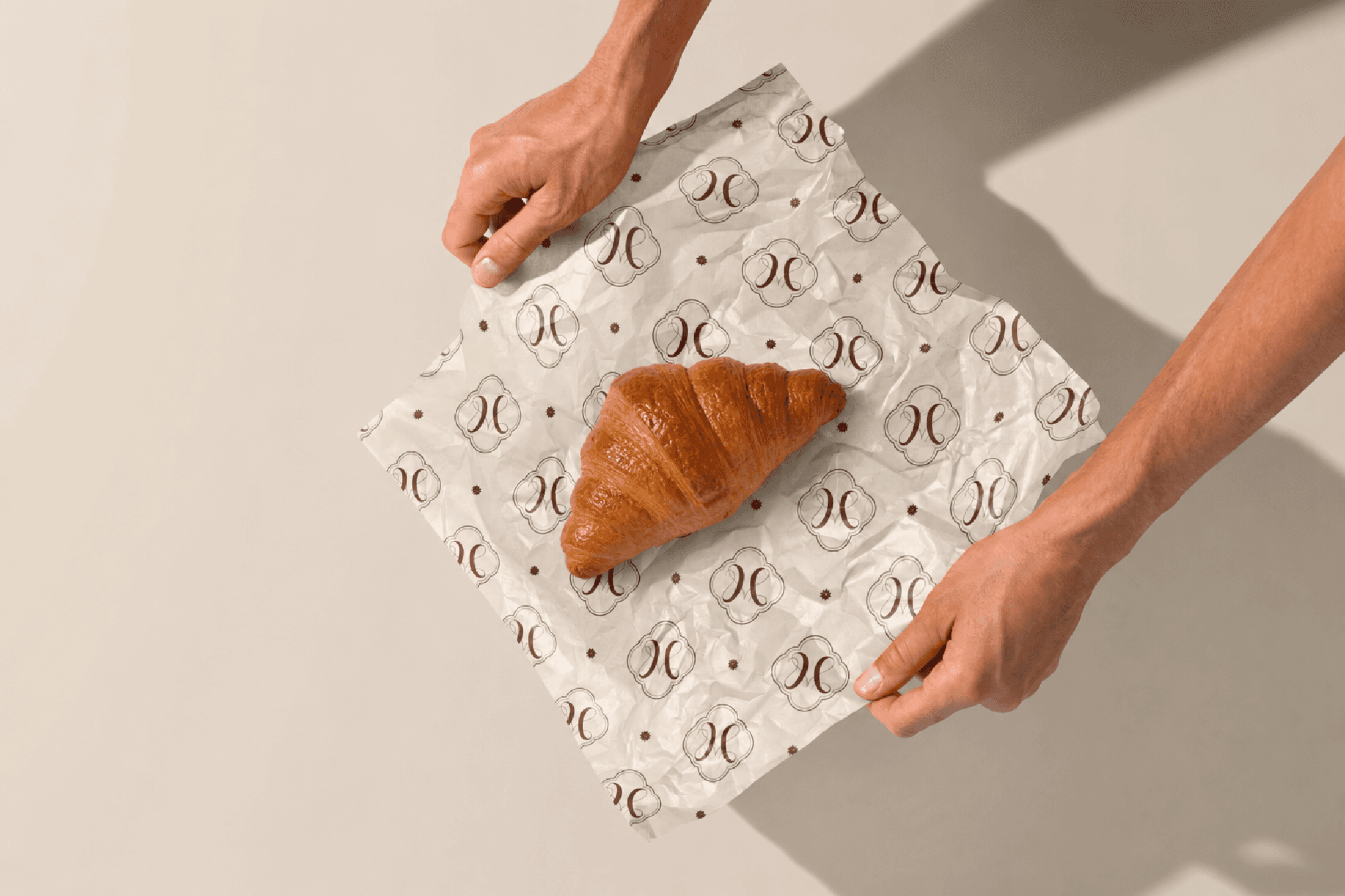
We built the identity around a ribbon-inspired symbol, referencing the care and presentation associated with handcrafted products without illustrating them literally. Paired with refined typography and a minimal visual system, the ribbon became a recurring element across packaging and digital applications, bringing movement and consistency to the brand.
We built the identity around a ribbon-inspired symbol, referencing the care and presentation associated with handcrafted products without illustrating them literally. Paired with refined typography and a minimal visual system, the ribbon became a recurring element across packaging and digital applications, bringing movement and consistency to the brand.
We built the identity around a ribbon-inspired symbol, referencing the care and presentation associated with handcrafted products without illustrating them literally. Paired with refined typography and a minimal visual system, the ribbon became a recurring element across packaging and digital applications, bringing movement and consistency to the brand.




Feeling inspired?
Let's make it happen.
Connect with us using the button below or directly at contact@avramgo.com.
Feeling inspired?
Let's make it happen.
Connect with us using the button below or directly at contact@avramgo.com.