Super Weightlifting

Super Weightlifting

Super Weightlifting

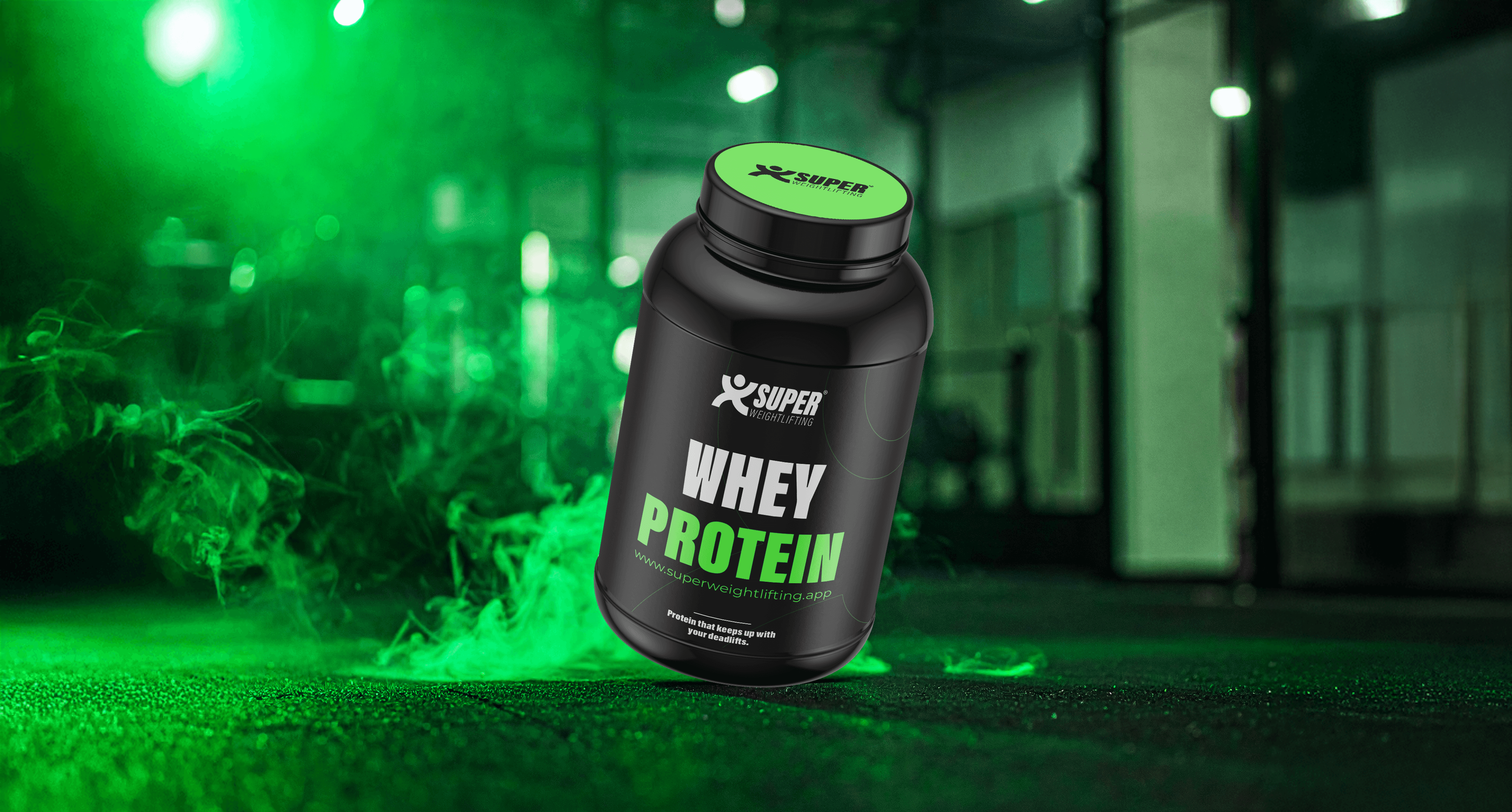
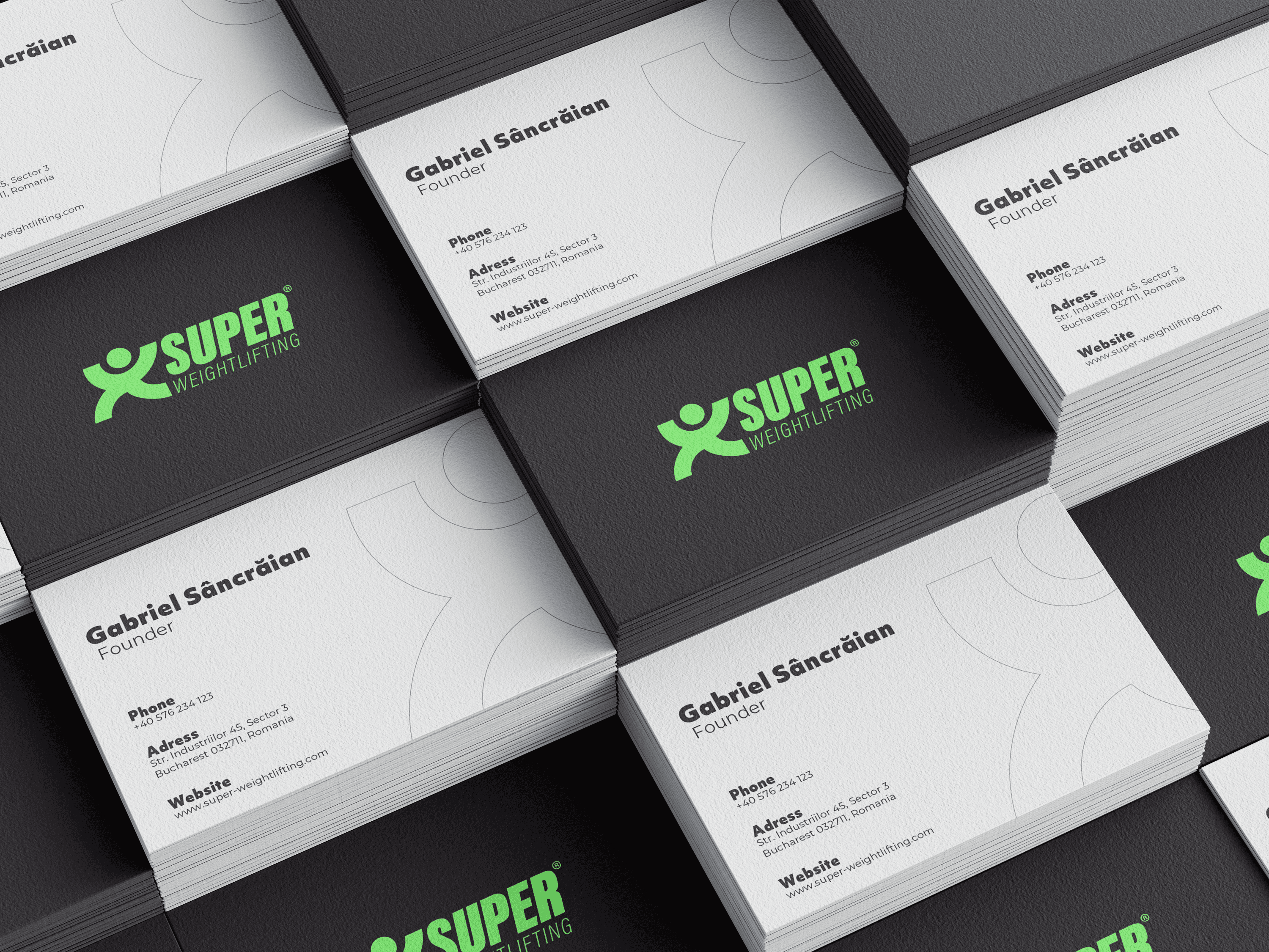
Super Weightlifting is a brand dedicated to weightlifting enthusiasts and strength training athletes, built to inspire performance and discipline.

Super Weightlifting is a brand dedicated to weightlifting enthusiasts and strength training athletes, built to inspire performance and discipline.

Super Weightlifting is a brand dedicated to weightlifting enthusiasts and strength training athletes, built to inspire performance and discipline.

Brand StrategyVisual IdenityBrand Guidelines

Our Goal

The main goal was to design an impactful visual identity that captures the spirit of elite strength training. The focus was on building a brand universe that communicates raw power, discipline, and authenticity, resonating with athletes who constantly push their limits.

The main goal was to design an impactful visual identity that captures the spirit of elite strength training. The focus was on building a brand universe that communicates raw power, discipline, and authenticity, resonating with athletes who constantly push their limits.

The main goal was to design an impactful visual identity that captures the spirit of elite strength training. The focus was on building a brand universe that communicates raw power, discipline, and authenticity, resonating with athletes who constantly push their limits.

Solution

Solution

Solution

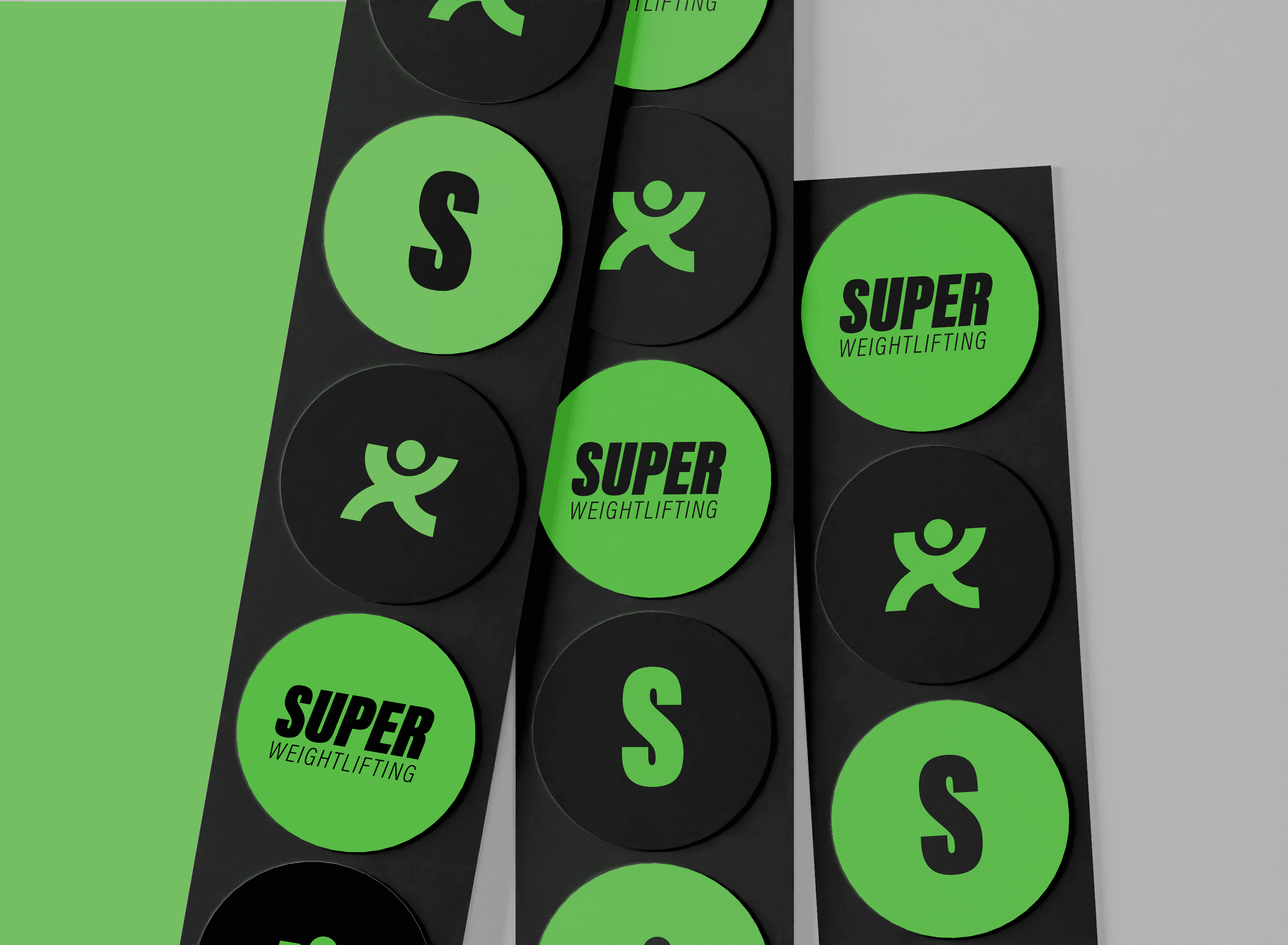
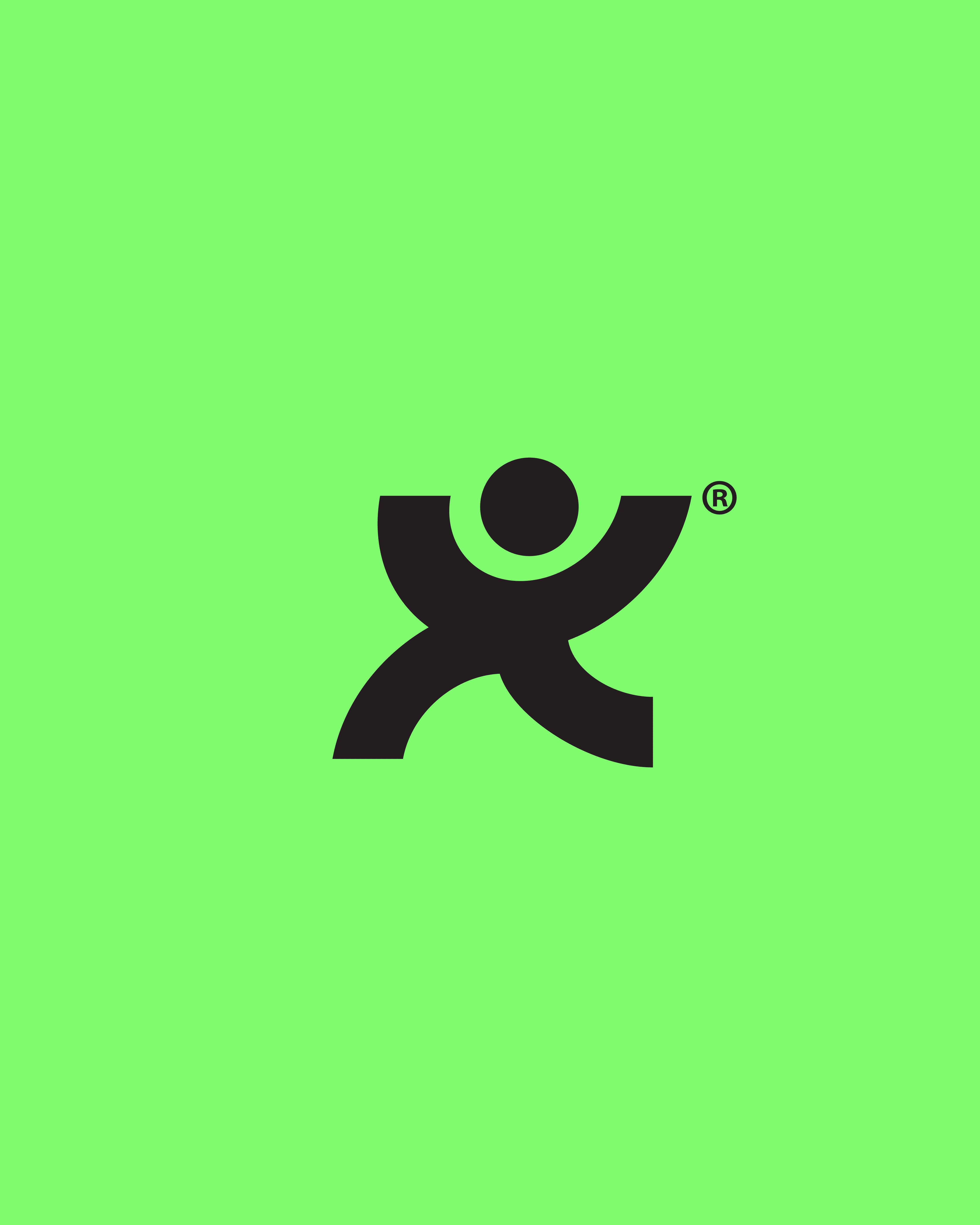
We approached the identity with a focus on clarity, structure, and movement. The icon, a lifter captured mid-jerk—serves as a direct visual reference to the sport, adding both symbolism and recognition. Typography was selected for its clean, heavy forms, supporting legibility and impact across digital and physical formats. The layout system is built to feel grounded and powerful, while color contrasts and spacing ensure high visibility and adaptability in dynamic environments. Each element was chosen to reflect the discipline and intensity of training, without losing flexibility or modern relevance.

We approached the identity with a focus on clarity, structure, and movement. The icon, a lifter captured mid-jerk—serves as a direct visual reference to the sport, adding both symbolism and recognition. Typography was selected for its clean, heavy forms, supporting legibility and impact across digital and physical formats. The layout system is built to feel grounded and powerful, while color contrasts and spacing ensure high visibility and adaptability in dynamic environments. Each element was chosen to reflect the discipline and intensity of training, without losing flexibility or modern relevance.

We approached the identity with a focus on clarity, structure, and movement. The icon, a lifter captured mid-jerk—serves as a direct visual reference to the sport, adding both symbolism and recognition. Typography was selected for its clean, heavy forms, supporting legibility and impact across digital and physical formats. The layout system is built to feel grounded and powerful, while color contrasts and spacing ensure high visibility and adaptability in dynamic environments. Each element was chosen to reflect the discipline and intensity of training, without losing flexibility or modern relevance.

03 · Două poze
03 · Două poze
05 · Poză mare
06 · Poză mare
07 · Poză mare
08 · Poză mare
09 · Poză mare

Feeling inspired?

Let's make it happen.

Connect with us using the button below or directly at contact@avramgo.com.

Feeling inspired?

Let's make it happen.

Connect with us using the button below or directly at contact@avramgo.com.